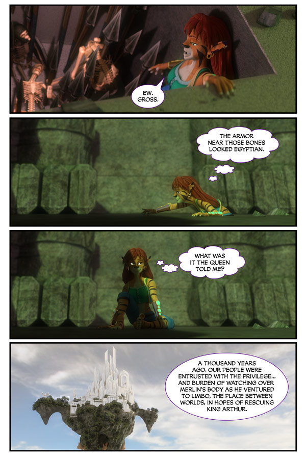
Page 1704…
Thought balloons…
I don’t use them. In fact… I can’t remember ever using them in Dreamland.
Though, I suspect I might have once. I don’t know.
Anyways. My script didn’t call for the dialogue/thought in the second and third panels.
But I didn’t feel it was clear enough otherwise once I put the art to the page.
The next 3 pages are going to be flashbacks explaining the “mission” the Pharoah and Queen had sent Felicity on.
I didn’t know if I should “fade out” the edges of these panels or something.
Any thoughts? Thought bubbles? Yes or no.
Edges on the flashback panels? Wiggly? Faded? Keep them?
The pitfalls of doing daily comics is… you just don’t really have time to work these things out.
Would love some feedback.
Thanks
Scott


Maybe change the overall color tone so it that it looks “older”. Sepia tone a bit.
And thought bubbles .. I’m cool with. It’s the character thinking, which doesn’t necessarily need spoken. Though, from what we know of Felicity she talks more than thinks so …
On flashback panels, i think faded out edges would be good.
On thought balloons, there are a bunch of different ways these get handled. The cloud balloons look fine to me, but if they bother you, you could try free-floating text (no balloon) or lower the opacity of a balloon (but don’t include the “speaking” tail).
Personally what i use is a couple circles where the speaking tail woud be.
Also as to thought bubbles – she is traveling alone, in a dark area, looking for traps. What’s to say she wouldn’t be talking to herself?
The thought bubbles aren’t really a problem. Everyone has something going on between their ears.
The voices, however, can be a bit of a problem. Although the arguments they have can be some what annoying.
So, providing they remain thought bubbles, for our favorite Cat Goddess, I don’t see a problem.
The rest of us, however, are on our own. Except for those damn voices.
Like it as it is!
Faded edge for flashback sounds good to me.
Thought bubbles for character’s thoughts sounds good too….
The cloud shape of the thought balloons seem really cheesy/cartoony. I like the suggestion someone made above of simple ovals (no speech tails) that have a lower opacity. Just place it near her head and it’ll be obvious.
And yes, the flashback should have some kind of treatment to make it different than the present.
I like the idea of faded edges for the flashback pages, otherwise the thought bubbles look fine! ^_^
I wouldn’t go the sepia route for ‘memory lane’ though, it’s bit overused and basically takes all the colour out of everything in my humble opinion. >_<
For most of your flashbacks throughout the story, and backstory segments you have used the block bubbles. That would be my suggestion.
I have no problem with thought bubbles. Sometimes a few words can tell as much or more than a picture.
Interesting…
The fact that there were bodies in the bottom of that pit proves that either some of the traps are able to reset themselves for the next victim… or someone reset the trap.
Anyway, I’m sure Felicity will come through and complete her mission – somehow. But when she comes back with the tablet and tells the tale of how she got it, I sure hope Alex awards her with a medal of some sort. She will have earned it!
Alex can do that, right? Being the King of Dreamland, he can surely issue a medal to honor her bravery. (I’m picturing that scene at the end of Star Wars V: The Empire Strikes Back, where Princess Leia awards those medals to Han Solo, Chewbacca, and Luke Skywalker.)
It worked just fine for me as is, Scott. 🙂
The thought bubbles follow your form for the speech balloons. It looks seamless with the rest of the pages. I think it should stay as it is.
Id have to agree with getting an older look… the floor on the first panel here gives me the feelings its been freshly decorated with a nice new green carpet
You know, you did use them before, but I can’t remember where or when. But I do remember that you asked the same questions the first time. 🙂 Or this just a déjà vu?
I believe Tadd was talking about making the flashback panels beginning in panel 4 for today’s strip look older with sepia toning.
The thought balloons should be connected to the character with round bubbles, not small clouds. Apart from that, it looks fine.
I always read the comic before your comments. The thought bubbles seemed perfectly natural, and the transition from third to fourth panel was absolutely clear.
Just one minor detail:
If the “small” bubbles of a thought bubble were plain circles (ellipses), and not clouds of different sizes, it would look more natural. As in: “comic” natural. 😉
Only previous use of a thought bubble in The Dreamland Chronicles:
http://thedreamlandchronicles.com/comic/page-1566/
ah ^^ right… still!