Page 949…
Hey Guys!
Hope you like the new look of the site.
It’s still a work in progress. Tyler Martin of Comicpress http://comicpress.org/ is working on cleaning up the site and adding some MUCH needed additions to the site.
One thing you may notice…
Replies in the comments. yes. You can reply to a particular comment.
Some things we’re still working on:
Desktops, Fan Art, and a working bookmark tool.
He’s also cleaning up the Archive too.
So please be patient as he cleans up my dirty site and makes it all shiny and new.
I hope you had a great weekend. And please let me know if you have any other suggestions.
Scott


The site seemed to go down completely for me earlier. I tried loading it and all I got was a white screen. Is that just from trying to upload the comic with the new layout, or did something happen there?
Honestly? I feel like the new buttons don’t match the rest of the site. They look like they should be on a media player of some sort, not on a fantasy-based layout. Sorry.
I bet that was to add the new non-gravatar avatars for people who dont have gravatars it shows those cool replacements.
Only temporary placeholders! 😉
They look shnazzy. 😉
So far looks alright Tyler. No doubt if Scott trusts you with the site, there’s good reason for it!
I look forward to seeing how it looks when you lean back in your chair saying, “I’m done…” 😀
Err… looking forward to seeing th site then, not you in the chair… yeah… Okay I’m gonna stop now. ^.^
~Prince Demitri
They look like you stole them from Quicktime. 🙂 Glad they are just placeholders.
I hope you hurry with the new bookmark tool. I miss having one. ;_;
I love the new buttons, but agree that they don’t fit the look of the site. Maybe if they looked like Alex’s sword instead of arrow heads….
Tyler, why don’t you get Scott to design some buttons for his site.
I bet he would love to create some DC buttons (and we too), ain’t you Scott?
“Close your eyes Alex. Feel as the wind flow by, then grab onto it!”
I don’t know why but when someone says training I see an imaginary montage.
Also nice comic 🙂 The only thing that i would have liked to see is a “Hey I’m not your postman!” “Yes you are.” kind of thing. 🙂
Been watching a little of the site rework, and the site needed a little cleanup. Looking good so far.
However, I do think the new buttons/themes are slightly too “computer age”, maybe a midieval design goes a little better with a comic of this style. – Or you could opt for a slightly more “modern” look, by adjusting the theme around the age of the school that alexander is attending.
I miss the music player, it was a nice addition.
I don’t like the html tags with parameters, they’re quite an obvious avenue of site/server attack, and you’ve had a few of those over the time I’ve been reading the comic. But that is up to you and the designer to decide and secure.
I’m in agreement with Comtcom1. The buttons being bigger is nice, but a bit too modern. Since Dreamland is the main theme use something that corresponds with that unless you’re going to change the whole layout? I’m thrilled the site is getting upgrades 🙂 You rock.
Hey! I finally got an avatar! I’ve been having trouble getting one. I think the problem was me not the site, but it’s wonderful to finally get them. I wonder if it will stay the same?
No…ha ha. I hate designing buttons.
I’m horrible at it.
😛
But if need be…I’ll do it.
I’m hoping Tyler has some magic in his hat…
Actually it’s still there. Up on the top right of the page.
Thank you.
What’s the postman thing about?
Oh. The Jukebox! You’re right.
Hey TYYYYYLLLLLEEEERRRRRR!!!!
Good Question.
Tyler….will people retain the same one?
While the new buttons look nice, they don’t really fit the theme of this granite look you have. Still, they look great.
LOVE the new look of the site, Scott. And the page is as good as ever.
Well, since Alex is carrying letters back & forth… 😀
Ah. Funny.
SOrry…I thought you were quoting something.
🙂
I was just over at Lora’s Dreamer site and saw she’s trying out Fan Flow.
What do you guys think about this?
http://O.assetbar.com:80/index
Exclusive content for subscribers? Does this interest anyone?
If so…what would you like to see?
Agree! And having the buttons turn red/links purple is a little painful when you look at the theme and mood of the page as well. But great update, and very shiny website updates!
So, non-Gravitar folk get Dreamland avatars? It looks pretty cool!
I was just thinking, what if that headpiece on Orion’s head wasn’t a skinned creature but was in some sort of hypernation and awakes to give Orion advise on important matters just as the sword awakes to give its say. It would probably freak everyone if it’s eyes suddenly open all of a sudden. Sorry, just daydreaming.
Love the look of the new site! I think the buttons are sharp but agree that some more fitting the site would be even better, (course, that’s probably true for my site as well).
TRAINING?! Who goes to Dreamland for training? Well, if it’s for flying, that’s okay. Hang in there, Alex…
Remember to vote! Dreamland Chronicles has already slipped to no. 6! Yikes!
If non-gravitar folk get a Dreamland avatar, I hope deleting mine works for me.
I think Alex’s disapointment is that he can’t hang out with Nastajia, but how is training going to be handled? Do we follow him step by step, a montage with 80’s songs in the playlist, or follow around Nastajia and the gang as they do their own thing like Paddington telling Kiwi about the rock giants?
How about now then?
Yes, it should stay the same until you add more icons to the avatar folder.
well the jukebox is there but no sound/or songs for that matter.
Ah. Good good. Can’t wait to see what you come up with, then. 🙂
correction.
the playlist is there on the main site but when you look at the comments it pulls the playlist.
Now will shall begin some training! Training is almost a must in any action series :), I wonder what Orion will do? (We now he won’t throw him off a cliff XD ) With the buttons,Scott, I do agree that they look too modern, I hope that you will redesign them.
I think some “vortex like” buttons would be nice, personally.
Am I the only one who thinks that Nastajia’s hair looks a LOT darker now? :U Or maybe this has already been discussed and I just missed it with my college work going on. XD Just like I missed all this New Age mumbo jumbo.
Also, love how “excited” Alex is about training again. :3
Wow!
this looks great
I love the new look of the website! Very stylish.
My one complaint about the updates to the site is the long URL you’re using now. The page # seems redundant. If you have to use the longer URL /20##/##/##/ why just end it with the date? Weregeek uses that format and it makes it so much easier to update bookmarks. For example: http://www.weregeek.com/2009/09/07 . All that’s needed to update the URL is changing the last one or two digits to match the date (07 to 09).
Also, somthing to think about: If you’re going to be getting rid of the existing system (/?p=####), think about how many other web pages may link to that page.
Just trying to help 🙂
Oooooh, new layout! Very nice indeed.
Can’t really say anything that hasn’t been said already. I’m just too slow getting on here these days. 😛
And I totally had something useful, but got completely distracted playing with the ‘get an avatar’ link and now have no idea what it was I was going to say. Oops.
But apparently, it didn’t work. What step did I miss?
the /?p=### still translates correctly to the right page regardless of the new permalink structure
At least the good part is the back and forth buttons are place-holders(the media-player style seems a little out of place with the fantasy.) Hope you had a good weekend Scott, and keep up the good work!
It didn’t show up on my PS3, which I was on at the time.
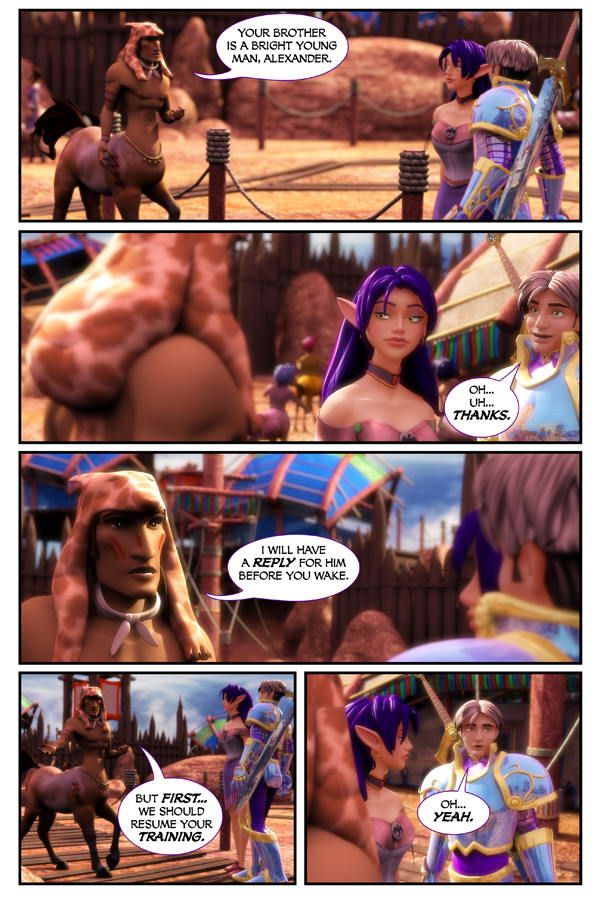
I love Alex’s expression here! XDD (It matches the “oh…YEAH” perfectly!) *snicker*
I LOVE the new REPLY format! Also Love the big buttons!!!
Gee, Alex, don’t restrain your enthusiasm for the training! Remember how much fun it was to fly?
I remember when these changes started happening! I must be getting close to catching up …
🙂
ALex: Couldn’t it wait?