Page 886…
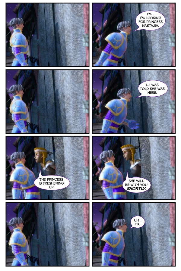
Another 8 panel page.
Yikes. What’s this world coming to?
Well…I hope you don’t mind essentially getting what would have been 4 pages turned into 2 pages over the last 2 days.
In other news…
The Penguins forced a game 7 last night! Yay! So happy.
Hoping that maybe…just MAYBE they can pull of an upset win and hoist the Stanley Cup in Detroit.
How cool would THAT be???
Oh…and great news. I finished my latest book. Animal Crackers!
Here’s the cover that Tracy Bailey did…
We have some tweaking to go. But this book isn’t due until first quarter 2010. So we have some time.
We just needed to solicit this and Dreamland book 4 by today.
Now I have to put together my schedule for next year. I have 6 more books coming out next year (7 if you include Dreamland).
Boy…what am I getting myself into?
I hope you guys are doing well…and have a great day.
Scott


Discussion (36) ¬
Funny how Alex leans back to listen and leans forward to speak. Sorta like one of those little bobbin birdies you put next a glass of water.
The humor’s hilarious, with him trying to talk to the cloth door. Especially how you show the pauses. Not so much a fan of the eight panels done that way, though…. I like the idea of getting so much in a few pages, but the harsh sections really distracts from what’s happening, in my opinion. Maybe if you could change the boxes? Normally I wouldn’t say anything, as your work is always awesome and it’s your vision you’re trying to get across, but I just simply haven’t gotten into the action of these pages because of the set up. It seems to interfere with the seamlessness of the rest of pages, where they all flow so organically from one panel to the next- while these panels flow really well, the panel layout distracts from that. If that makes sense.
Just my opinion, and I know you’re probably just trying it out. Thought I’d give my opinion since I noticed it right away, and I can barely wait until you continue using other panel layouts again. That said, it’s a great idea to try and combine those scenes into two pages so you have more room on the other pages for what’s coming next. As always, you rock, Scott!
Hehe, nice. Panels 1, 3 and 7 look suspiciously much like copy-paste though 😛
Looks like lean back to think and wait, and panel 5 Yikes, too close! Funny and good effect. Tells a lot in a small space, and yeah, not enough going on for two four panel days.
Dreamland is #24 on TWC top 100 comics, who forgot to vote!?! *waves the Dreamland flag*
WooHoo. Sounds like Alex has a hot surprise date coming up in a bit.
Centaurs have that way of leaning forward at a harder angle to speak to you face to face at your height. It can be very intimidating. Her upper body must be at a 45 degree angle or more.
“Freshen up” makes me wonder if Alex has ever needed to eliminate waste while in dreamland…
I like the 8 page layout, but I think it’s maybe too much if used constantly. I discovered your comic about 8 months ago and it has become a daily stop every morning.
But, I have to disagree with you, being a Michigander, I hope the Wings hoist the beautiful Cup of Lord Stanley on Friday.
Yes LtHorn46, our boys sure look good with silver thrown in with the white and red color scheme, lol.
Go Wings.
For a minute there, as I scrolled down, I thought this was going to be a; “I’m sorry, but the princess is in another castle” joke…
I thought this one was a riot! 🙂 Remindes me of Bob from Reboot when he’s working on his car, the way he moves back-and-forth from under to hood to the side.
There is no way the flightless birds are gonna be allowed to touch the Stanley Cup in Detroit 😛
This might be a good opportunity to try a more unique “comic book style” layout, where minor events don’t need an entire square. I like getting this in two days because the lack of development would have made me impatient, but you might potentially spread it out for the book.
Congratulations on finishing the new book!
Detroit IS hockey town and no one has lost at home. You know what’s going to happen.
It would be EVIL EVIL EVIL if thePenguins beat the Wings! Go Detroit!!!
Oh! So many Red Wings fans?
Where have I gone wrong?
So sad…oh…so sad.
It has been a good series. It should be a good game, but I have to side with the others…..GO WINGS!
BTW….what would be evil is if Alex where to “wake up” right about now….
Hmmmm…. Can he wake up since he doesn’t have his sword? And if he does, can he get back to dreamland without it?
Hey Scott, I’ll back you up.
GO PENS!!!
Love panels 5 & 6! “Back away from the door, buster!”
if he wakes up without the sword?
Hmm, maybe somebody already posted this, but I haven’t seen it.
I *love* the humor in the page and how Alex interacts with the door. I wouldn’t change that at all. The 8 panels however…I appreciate the condensed pages (I really miss Nastajia) but the 8 panels hide a lot of detail and art, which I absolutely adore. Maybe they should be spaced out a little more in the book. I own all three and I pause a bit on each page to really see the art; maybe its a force of habit being so used to one page for 24 hours. But the art is what drew me to the comic in the first place, and the engaging characters had me hooked.
I also love the 5th and 6th panels. Its as if she is saying “We heard you the first time. Just take a chill pill already.” She definitely gets in his face. here is also an interesting mental picture for you (taken from my pen and paper rpg days) a half troll half gnome riding on top of a minitors head between his horns. (the funny thing is the character also has the riding skill.)
My gf is from PA, and she loves the Penguins. Hopefully the pattern breaks and they win in detroit.
The panel layout works well for those scenes where not much is happenning. It allows for the dramatic expression of silence pauses. At least, I call it dramatic expression. since I don’t know what it is called when you try to convey a certain emotion/idea/feeling/ambiance by altering the panel layout.
GO PENS! Every time I ate Buffalo Wings (red in color of course) I was trying to eat away at the Red Wings. Boy, I ate a lot of wings. I’ll say it again. GO PENS!
I’m really enjoying the humor here ^_^
I wonder what Nastajia looks like in a regular outfit!
One thing I notice is that Alex’s blonde hair is almost gray in comparison with the centaur’s blonde hair. So the splash of color is like WHOOSH!, while Alex’s hair is kinda blah.
Her locks must be neon in the daytime! jk ;D
Why do we care about the Pens when the STEELERS exist? Seriously.
I agree with Radical-Knight about how funny it is when Alex leans back to listen and leans forward to speak. And then when the centaur leans out, he has to lean wwaaayy back!
Hockey, that’s that game with the sticks and the ice and the fighting, right?
Go author’s team!
This page always make me laugh for the bad images I get in my head.
I noticed the blond haired centaur, too. But, did you notice that all the centaurs have a very strong Native American look and cultural trappings? In that respect, the blond hair does not fit…
That Centaur is certainly… friendly…
No one ever goes to the bathroom, or sleep. It’s freaking me out man