Page 751…
Thank you guys again for the feedback on the last two pages.
I really do appreciate it.
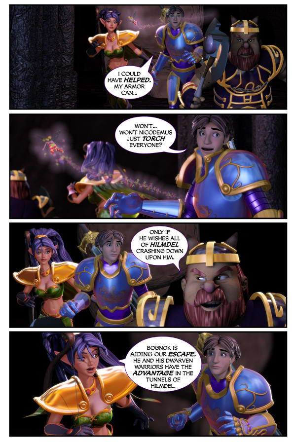
Today’s page starts the pages done on the new system. Maybe you’ll be able to tell…maybe not.
With the faster computers…I’ve got more time to tweak lighting. So I think they look a bit better.
🙂
Anyways. Thank you all again. Thank you for reading. And thank you for participating.
You make Dreamland a better place.


YOu said new, so I think i can see it. I probably can’t, but I think I can…
Should have waited to the 5th new page, then had a poll on when the new pages started. Also, I got 5 on the RSS again today.
I jumped between this and the last page a couple times. I think I can see a difference in Nastajia’s shoulder armor. (Being in both pages helps.) In this page, there’s more gleam to it. A more metallic look.
Been reading for a few months now, and I’m greatly enjoying the comic. It’s very well done, and I plan to pick up the books someday. Just felt this was something I could comment on.
Excellent work! Keep it up!
Yeah Alex probably could take on Nicademus, I mean he has a weapon that has already hurt him, he has armor that has already stopped his dragon halitoses. so why dosnt he just stand and fight him.
maybe that will be in chapter 26
‘coz that wouldna fit into this kinda story. I don’t reckon Alex fit for a fight with Nicodemus in all earnest, seen? He barely knows all the nifties hidden in his armor nor how to git that sword movin’ in the right way.
Besides – there is something different in the page. I’d rather call it an increased clearness and more shiny light spots – f. ex. on Nastajias (sic?) armor. *g*
Fine page, as all the others are.
I agree on the shoulder armor, and also she looks somehow even more beautiful. About Alex not fighting back, I would like to share something; not for the author but for other readers:
It is not about power, it has never been. It is about conviction, believing and selfawareness.
Remember, for Alex it is all a Dream, he is still unsure whether it is real or not; and if it is, then really worried about dying in the real world as well as in the dreamworld if he risk it.
And it is not his fight. Not yet. It will be when he really believes and acknowledge himself as the rightful ruler of dreamland. THEN he will be powerful. But off course, this will come at the end or near it. He is starting to believe but for now is the time of the war of the Dwarves.
Oh man I just LOVE this Story.
I agree with Lord Bounty.
However, I generally do not compare the “quality” of the pages. In my opinion, they all look great. I even enjoy the pages with errors (such as spelling or grammar) that have popped up from time to time. Too much analyzing/comparison of the art takes me out of the flow and diminishes the reading experience for me.
I love this series and I look forward to what comes next as much as I have to what’s come before.
Scott –
If you hadn’t mentioned it, I might not have noticed – but the lighting does look better in a very subtle way.
You’ve got one huge advantage here. Even if you think your technique is improved and you’ve learned, your first CGI strips in The Dreamland Chronicles started from such a high level that they still look good. 😉
So many artists get going on a comic strip, and if successful, somewhere down the road find themselves apologizing for the first strips. I can only imagine what things will be like by the time you can wrap this up.
Great work!
Turn off the lights, you dwarves. Nic may flame ya, but he can’t breathe fire forever!
I can tell the difference–it looks great! The lighting looks fuller. Really brings out the metal armor.
Is it just me, or does Najista’s cleavage look more pronounced in the latest page?
Very noticable difference! Adds wonderfully to the already stunning art.
Thank you all.
Again…I don’t expect everyone to see it. I see all the flaws.
And thank you ALL for not seeing them all with me…ha ha.
From the first pages to these…I’ve grown a lot artistically.
I hope I can continue to push the medium.
Oh…and EREGNON…
I noticed too while working on the page. It’s because she’s bent over during the run. Hope it doesn’t offend anyone.
Yeah, I definitely noticed a difference. Me like. 🙂 Also, Think it’s funny with Alex playing catch-up – now as they’re already leaving he’s like “hey, I could help…” Heh. Great stuff.
To be honest, i wouldn’t have notice a difference. now that it was mentioned, i do see the difference in the shoulder armor from the last page… but then, from what I could tell, they moved from a large hall into a smaller tunnel, thus changing the lighting anyway….
Scott, you are just a perfectionist (I appreciate that)!
Ooh there IS sumthin different about this page!? It seemed so but I wasnt sure until you said so! Seems a bit shinier or sumthin, but no matter wich way I still like it! 🙂 Im all for the storyline, not so much the quality
Definitely agree with Eregnon – and no, it definitely doesn’t offend!
You know, before I even read the commentary, I said to myself, “the lighting looks more natural.” lol, way to go Scott
I can definetly see a difference. I Like IT! And here I was not knowing how you could make it better!
It’s always looked great, Scott…though the lighting adds a great deal to this page, and the metallic shaders seem more pronounced (in a good way). Keep it up, man!
Looks good, Scott! You’ve made the lighting more natural and reflective surfaces shinier without making your former pages look bad. Superb work as always.
First thing I thought when I saw the page was that the details were enhanced !! And then I got to read the comment, which explained that !! About cleavage, I don’t believe you, I am sure you just finally decided to go for the Wapsi Square version of Nastajia :p Just jocking, and absolutely not offended, more like the other way 😀
So again : great job !
I feel so validated. So Nic really DID forget the first rule of fighting Dwarves, “Never fight them underground, especially if you’re a flying creature with a ranged breath weapon attack”.
Also love the tweaked appearance of the comics and no, you’d have to go a lot farther than having Najista leaning over a bit to, offend either me or even my young Son. You see more than that walking down the street near the beach by our house.
I’m not making this up, but the same week you’ve upgraded to a new machine I’ve upgraded to a new HD monitor! O_O
But you know, even before that I noticed your renderings getting more and more lifelike shading/lighting wise, so I think it’s safe to say the new monitor only adds to the effect. 😉
And no I don’t think Naj is offensive, hell it would look pretty unrealistic to be running for your life whilst bolt upright! 😛
I find myself staring more at her shoulder guards than anything else in the last panel anyway. I don’t think I noticed before how much movement she has in those things, pretty nifty!
Oh and speaking of the last panel, Nastajia’s hair is perfect man, PERFECT!!! 🙂
I noticed the lighting was different, but I assumed it was because they are deep in the caves. The armor on the characters seem sharper.
I have to say, Scott, I noticed right away the sharpness of the lighting on this page. It really caught my eye. I love the bright highlights on the hair and armor. Excellent work.
So is your new machine a PC or Mac (don’t mean that as a loaded question. I’m just curious.) I’d love to know what you got and how you’re liking it.
Yeah, I can tell the new colors, the new rendering as such… looks hella better. More depth to it. I notice very little in the flaws area tho… but that’s just me.
Great work on these last few pages Scott. Looking forward to more.
Jon
I just found this yesterday, and read through the whole archives. Beautiful storyline, beautiful artwork. Incredibly well written. You have a fan for life over here. 🙂
live.
Well, i can speak only for myself and i’m not offended. ^^ Also a factor may be that Kiwi is here the main source of light who is slight ahead and above Nat, providing some additional highlights (no pun intended ^^ ).
I know it’s not good form to comment this late into the game, but I totally agree with this. Even though I’m nowhere close to being a good artist (or maybe even an artist), the quality of my first comics absolutely suck when compared to more recent ones. I can only speculate that maybe it’s because we start sharing our work early, but even the pros show improvement (or at least change) over the years.
Is that really all there is to it because that’d be flabbregastnig.
7CXVVm pitstrljnxiq