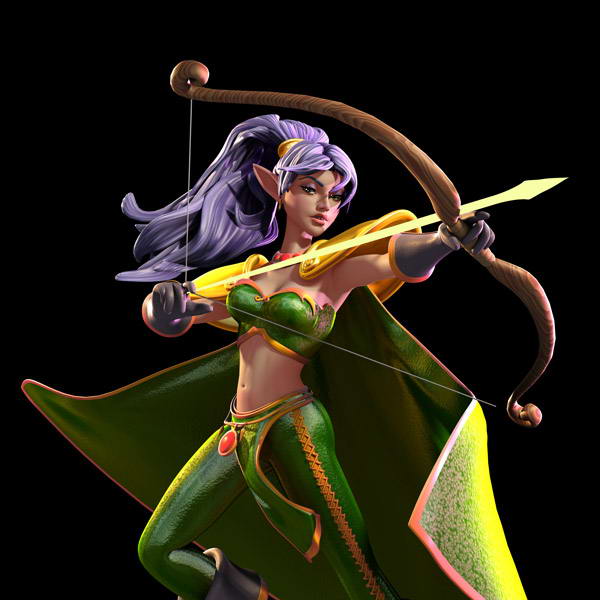
Making a new backdrop for cons 02…
Hey guys n’ gals…
So here’s another image for the upcoming backdrop poster.
Again…no touch ups. So you’ll notice the arrow and string don’t match up…and there’s a lot of other little issues I’ll clean up later.
So far the PSD file is over 2 gigs. So I hope I can put this all together. Yikes.
If you’d like to learn more…check out yesterday’s post.
See you all tomorrow.
Scott


Aww man! I just went through all of this comic (having read only a few pages before)…holy moly. Not only is it pleasing to the eye, but it’s so creative and capturing! Crap. I have another webcomic on my to-watch list. d:
Ah, if only my dreams were real…
ye
just a note. her draw hand needs to be turned so the palm is facing her and then she can use more than just one finger on the string. it would be pretty hard to draw a bow like that and with only one finger.
any chance of you posting a really hi-res version of that render? like maybe to the res you would use for your background? or really big desktop wallpaper (widescreen) res? 🙂
i so know what you mean Carrie i got 40< now, and well im an addict. on a more possitive note i dont drink or do drugs or get in fights and im no more a wow/eve addict and i’ve stopped eccesive gaming, all in all im better of than before.
she’s an elf and not to mention in dreamland, not saying that it wouldnt look more realistic, but like this its more free and “dreamy´´looking
+1 for comment above; that’s a pretty strong single finger she has there!
Also there’s something bugging me in the way her cape bends sharply on the sides… it feels more like a sheet of rigid plastic than some flowing cloth (and the shiny & grainy texture doesn’t help here).
Sorry if it sounds negative, just trying to help! 🙂
Apart from that the pose is very dynamic and should make a striking poster.
On matters of 3D, I for one more than understand the amount of work and time it requires. I also understand that most folks become defensive with critiques. If you’re looking for a more dramatic/dynamic look for your background, I might suggest (no offense) that you have her looking away from the camera and toward her attacker with a far menacing look. My first impression was one of “Oh Hum, I have arrow of power.” — Please forgive if I offend in any way.
Been reading for ever now and just thought I’d suggest you double check some of your links. Tend to save the pages for the end of my work week then read all of em at once. Unfortunately 3 of the last five tried loading a trojan on to my system. Might have just been me but thought I’d give ya a heads up 😉 Love the work though and look forward to the next chapter when it graces these pages 🙂
Thank you all.
Welcome new readers.
Suggestions and comments are ALWAYS welcome…and I always take them seriously.
As I said before. These images are rough. I’ve not cleaned them up. So please do feel free to leave comments.
It helps.
Roatha…
Trojans? On what links please? I need to make sure the site is safe…so please do let me know.
Thanks all.
Scott
I hate to point this out…but she looks like she’s high on ny-quil. I wouldn’t want her shooting at anything, unless I was behind her, looking like that.
Wow, I love that picture of Nas!
It could just be the lighting, but it looks like you’ve improved the textures once more 🙂 Nice render!
I like this one much better than the picture of Nicodemus, Scott. I have to agree about her hand placement around the arrow and the cape. The cape needs to billow back a bit more instead of point forward so much.
Also, it doesn’t look like she’s concentrating on anything. An archer is very focused on their target when they’re shooting. Some of them even stick their tounges out of their mouths without thinking about it, but I don’t think that’s the look you’re going for! ;D
Yay for Nastajia! Okay, I just like looking at her… I would so get this as a wall-scroll.
Looks good overall! Along with what other have said, you could take a look at her right knee. It looks a little like Gumby, doesn’t seem to be bending quite right.
Wow! I bet the finished poster will look AWESOME.
Add me as one more vote to fix the hand position. Also, as someone who grew up shooting archery, I can tell you that no one ever holds their bow sideways like that because you cannot sight down the arrow that way. Also, your body then interferes with the string. (I highly recommend that anyone who draws archers should take the time to get some lessons for themselves.) Still, very pretty picture, and it is great to hear that you are feeling so much better, Scott!
Gordon
I’d love to have that as a desktop wallpaper image. 🙂
well, there are some thing’s I would like to say. her right leg looks a bit smaller then the other, and the shadow from the ruby-pendent-thingamabober looks to big. she kind of looks out of it, like she doesn’t know whats going on- othere than those small details, it looks really good!
Awesome! I love this poster allready!
Thanks guys.
Again. I’ll be tweaking these later on.
So keep that in mind…
I also may have her look the other way. I tried it…but thought that for a poster to attract readers…maybe having her look your way might work.
We’ll see…
🙂
maybe you could have her point towards you so youre staring down the shaft of the arrow:)
She can use one finger for the bow because it’s a mythical arrow!!!! So there! You better be restin up Scott! San Diego Comic-Con is just around the corner.
Please… as an archer one thing always annoys me greatly when I see archers depicted in comics or even movies… there is -no way- you can draw a bow by holding 1) The notch of the arrow between your thumb and fore-finger. 2) Using only one finger. We’re talking 60 to 80 pounds here, folks. *chuckles*
Trust me, on an english longbow like I shoot, it’s a three-finger-job. And that means 3 fingers pulling the bowstring with the notch lodges between the top and middle finger.
I am also an archer but I really don’t have much of a problem with the way she holds the bow. Yes, it’s totally unrealistic, but we have to remember this is a work of pure fantasy. The way fighting arts are portrayed in works of fiction like this will inevitably be very far removed from the real thing, as the purpose here is to create action and drama, not bullseye a target at 60m or disable an attacker in the most efficient manner possible. The hand position should be a purely artistic decision, and personally I like the touch of whimsy that the single finger draw adds to the image. It reminds me of the sort of thing you’d see in a looney tunes cartoon.
On the other hand, whilst the render is really nicely put together, I do feel that the cape detracts quite a lot from an otherwise excellent image. I don’t know what Nastajia’s cape is made of, but I’m assuming some kind of cloth. As someone else pointed out, it looks way too rigid, and the bends in it look very awkward. It should billow in the wind and follow the character’s natural contours, not bend like a sheet of cardboard. The cape is a really important part of the image and with more work it could not only look much more natural, but also make the whole image seem much more dynamic than it is at the moment.
That said, you’re a professional artist so I’m sure you realise these things anyway, and I appreciate this is a work in progress as well. Great work so far and I can’t wait to see the finished thing! 🙂
Gotten my two number one female RP names from Nastaija. Nastai and Nastaij and I hope you don’t mind it Scott 😀 Just felt like giving my thanks for the awesome names 😉
Once again, I have to groan at one of the several subtle reasons I don’t like CG: It’s too shiny. Stuff that’s dull as carpet trends to shine like leather, it makes everything look plasticy.
Also, archery is fun, and if you’ve done it at all, you know it’s way easier to hold the bow at at least somewhat of an angle, though not usually that much. But you don’t hold the string with one finger. Three fingers!
I imagine little details like the bends in the cape are things that just need to be fine tuned later. I might suggest that it would be more dynamic if her aim were a little higher… if that could be managed without risking the way the bow frames her face and the arrow follows the line of her shoulder pad… having her hold the bow at slightly less of an angle might also help.
This is all just nitpicking, though. I think it’s stunning!
/agree with the nitpicks about the holding of the bow and the cape. I’d like a good two finger hold and a loose grip on the stave. You know about the cape.
Also, try her looking downrange at the target instead of at us with her eyes. I think it might be a better effect. Of course, you could try to rotate her so she is looking at us as we are looking down the arrow. 😉
Thank you guys.
Maybe it was a bit too soon to show these images as I’d not had a chance to tweak.
But…without pages yet…I was hoping it would be better than nothing.
🙂
Hey Scott, love the picture to me it shows real action, would even make a great figurine.
With the sort of tension that draw would take I’d also expect to see some definition in the abdomen.
Scott, Just wanted you to know that the review in SLJ (School Library Journal) did you some good. I buy the graphic novels for the Children’s Room of the Library I work at. I had already bought some of your titles for our collection but the SLJ article brought Dreamland to my attention. After checking it out on the Web I happily ordered all 3 books. And of course I read them. Hey, I gotta know what happens so I can book-talk them to the kids, right? Keep up the good work. I’ll be putting in a nod for you with my fellow Children’s Librarians.
Which links exactly I don’t know. I know when this page, the page for April 22nd 2009, and the page for April 17th 2009 all tried to load a trojan while loading graphics and such. I know I’ve had a few hits like this on other writers sites and such and while they are few and far between it happens from time to time 🙂
As an archer, I’m fine with the single-finger hold. She’s an elf, for crying out loud. The only thing I have a problem with is that her finger needs to go underneath the arrow, otherwise it would fall down. Stupid gravity. It’s a really dynamic pose though, I like it a lot. Her look says, “Not only am I a wicked archer, I’m hot.”
Clarification: the finger holding the string.