Page 1203…
Hey all…
Sorry for the slight delay in this page.
There are SO many things going on in these pages.
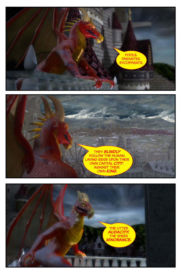
Nicodemus on a balcony in the castle of Astoria.
The rest of the castle in view.
The city below.
The gates.
The armies and land beyond.
The mountains beyond that.
Yikes.
I’m still not 100% thrilled with the final outcome. But I’ve also come to realise that doing a DAILY story…I have to let pages go in order to keep the story going.
Still…
Thanks for your patience.
Scott


Well, I, for one, think the results were well worth the wait!
I think this was a particularly successful page. I esp like the frame with looking over his soldiers at the oncoming army. Nice Mountains and Clouds.
I think it looks great. If you have time in the future, perhaps a double spread page showing Nic on one side and panning out to everything you mentioned up through the armies… That might look REALLY cool. But I don’t really know. ><
I like this page! Reminds me of Saruman’s tower in the movie “The Two Towers” just before he sent his army to Helm’s Deep! ‘Course, the situation is kind of in reverse, but the atmosphere feels the same!
I totally went “ooooooooooooo” when I saw this page and shivered a little. This is the first time I have really felt the intelligence of Nic’s evil (which, somehow, makes him +10 in the scary/intimidating department). Plus, you used the word “sycophants” which puts an extra bonus on the page! In my opinion, this page was a complete success, from artwork to character work. You “let go” at an exceptional spot. 😉
Love this page, I think the page turned out great, the mood is perfect, I can almost hear the storm.
Panel 2, though, it’s kinda hard to make out the army against the terrain, but with so many things to get right here, that’s just insignificant. Can’t wait for the next 🙂
Don’t be so hard on yourself, you perfectionist! Looks great and, you are right, pacing the story for us all out here awaiting is as important as the last pixel. After all, it’s getting exciting – War Is Coming!!
This is the first time that Nic’s text doesn’t have a yellow background with red text. Is that intentional because he is just speaking to himself rather than speaking forcefully to others?
I dunno, I rather like it. But, I understand how it was taking so long. Renderers have a hard time with things that are going to be smaller than a pixel in size on the final pixel, and it causes the render to take FOREVER. But at least you can fix it up for the book, eh?
Just in case you didn’t know, a couple tips for future large renderings like this (aka large armies in distance):
When doing far off armies, I hope you’re not using the full detail models. It looks as if from this far away you could have easily gotten away with shapeless blobs (aka rectangular prisms or something) or even a large one in the shape of the army with uv textures on it and it probably would have looked just as well with a lot less render time.
If using particles at all, definitely have their size increase and number decrease as distance increases. This is another trick that will reduce render time dramatically.
By implementing these tricks, my project was able to go from a 30 minute render per frame, to 2-5 minutes, depending on the shot. Just thought I’d share that from one 3D artist to another. I hope it helps for future shots! 🙂
You know, I knew something was off with that text, but couldn’t put my finger on it. That’s what it was!
Hmmm.. I guess there must be smoke coming from Your brains and Your PC, after setting that up…Needs more trees and people, though .. Nah..only kidding.
Now it’s only waiting for Nicodemus’ :”MWUWHAWHAWHA”I know Of Your Plans You Measly Insects….NO… WHAT?.. INCONCEIVABLE!!!” or something like that.. 😆
True, true… but look at the detail in Nicodemus..there’s about a gazillion vertices in just his face.
Oh, and the bit about rendering sub-pixel.. never knew that. It explains a lot. Thnx
Ack.
Good catch.
I forgot.
definitely, those clouds are beyond awesome
Fixed
Being a perfectionist myself, I was considering to suggest to adjust something in the second panel. The first and the third are really ok, but to me it seems that the second is lacking definition: you changed focus, trimming on the landscape, but it is too … I don’t know …shallow. I dunno if I’m making myself clear, but anyway it’s just the suggestion to reconsider the topping of a beautiful and delicious cake 🙂 So, don’t worry 🙂
I can totally see Nic going on an “inconceivable” splurge, and one of the nightmare guys going “you keep using that word,” etc.
Love… the… page… Since Nic is in the foreground, I think it’s totally legit for other things in the distance to be a bit out focus, like in a movie where the camera is focusing on something close by, and it makes distant objects look a tad blurry.
Looks like Nicodemus is convinced he is the rightful King–and therefore resistance is foolish and wrong. Therein lies the root of his evil and his usurpation.
Now to prove it, that might be more difficult…
i just love it!
it’s a great comic Scott!!!! really don’t worry about it!
it’s great!(but I already said that:p)
It’s absolutely beautiful. I think the first panel is my favorite with the details of the castle in the background. In the third panel I feel like I’m standing there next to Nic and he’s talking to me.
I thought we switched to night when I saw this page, but then the second panel is brighter again. The buildings look much darker again in the third. It confused me a bit. I guess that’s just the direction the darker clouds are moving. Really, though, the page looks fantastic and as always it’s worth whatever wait.
I dunno about gazillion. I’d probably say maybe 50,000, and that’s on the super high range, although it does add to it… you’d be surprised what you can get away with and have it look good.
Thank you all!
🙂
it’s okay, it looks good. i bet it took hell of a time to render though.
i like the way nic looks standing on the baloney .
I like the cloudy greyness of the last panel! Also… Nic is mentioning being loyal to the king too and the absurdity of revolt…. maybe something insightful here?
Great page. That was a straight up Chris Jericho promo that Nic just did!! XD
Scott, the page is beautiful. If you took so much time to render the second frame, we’d like to see the middle of it instead of Nic’s dialogue. I can’t see the gates.
Not intended as criticism. Still think that it’s pretty awesome.
You know, I really try not to make fun of spelling and grammar errors in this sort of environment, and that’s not my purpose here. But the mental image of Nicodemus standing on a big piece of baloney (or bologna, if you prefer) was just too hilarious not to share …
😆
Damn, I love this. This is all looking like it might turn into a “Battle of Pelennor Fields” sort of thing.
Thank you all! 🙂
it’s okay, it looks good. i bet it took hell of a time to render though. i like the way nic looks standing on the baloney .
Nicodemus: “Fools. Parasites. Sycophants. I couldn’t possibly have enough ketchup for them all.”
Uh-oh! I feel a villain rant coming on! Somebody do something or Nicky’s gonna monolgoue for pages! INTERVENTION!!!
I love Nic’s vocabulary.
If he’s allowed to keep going, the war’s over before he finishes talking. 😀
I’m finding Nicodemus’s attitude quite…insufferable.
… It doesn’t bother him that he is just wandering about… naked?