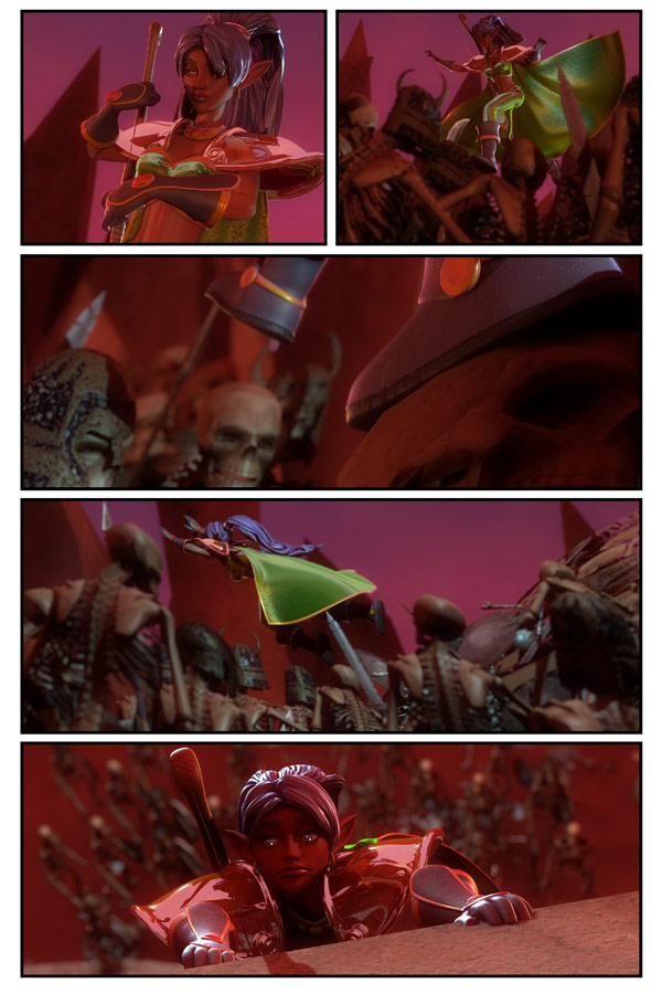
Page 1730…
So… I’ve got to say. I’ve not been to happy with these last few pages. I’m not happy with the storytelling, the lighting, the poses, etc.
I’m not going back and CHANGING anything, mind you.
I’m going to keep pushing forward.
But I’m not happy with the quality.
I guess some things work better in motion. Maybe this would have worked better in animation. I don’t know.
Happens from time to time. I’ll get over it.
I’m having a 20% off Sale on everything at my Etsy store!
Just use the COUPON CODE: ILOVEFALL
Don’t forget! THIS SATURDAY AND SUNDAY, I will be a guest at
I hope to see some of you there!
Please come visit!




i think it is good as it is,some day you are going to make a very good animationfilm of the dreamlandchronicles,and then are you so HAPPY!
Hang on!!!!
It does work, animated or not. What buggs me more is the fact DC will end after Chapter 20 (nooooo…)
Panel four – “Hey, y’all watch this!”, which is inevitably followed by…
Panel five – “Well, it seemed like a good idea at the time.”
the only problem i have with it is the pacing feels like she is taking a stroll as opposed to a mad dash. I think if we were to see the same sequence in an older comic book, it would be handled in one of those panels with multiple Nastajia’s as she bounces from skull to skull and lands hanging on the wall, if that made any sense.
I was thinking the same thing: what’s Elvish for “hold my beer and watch this?”
I agree. I think a more effective presentation would be to have several more panels, showing her treading on different skulls, with the second-last panel showing her in a more crouching stance, then the final panel the leap up onto the ridge.
P.S. it would also be better to place the camera from the side, so as to maximize the effect of her movement horizontally across the page. Showing a profile shot of her running across a line of skulls (split across multiple panels) would be much better than an oblique view IMO.
Personally (from the writing teacher perspective), I think the art is mostly strong–it’s just the fact that she’s not really interacting with anyone other than nameless enemies. That’s going to slow down the pacing a bit, and it’s difficult to translate it through art as well, because she’s not exchanging looks with anyone. It’s awesome stuff (I hope someday to reach that level of art skill!), but yeah, I think that might be the source of your frustration–action but no real back-and-forth interaction.
I think Niki Cox is onto something there. The lack of dialog impacts one’s perception of action vs. interaction. Still, as a story bit it works, Scott. Never you fear about that. And I suspect in the book format it’ll feel right just as it is.
….waiting to see if there is a hand that reaches down to help her up ….
Sometimes you just have to keep moving forward and do the work, and not just analyze the work as much as you would like. This is what it’s like to create art (or story) on a deadline.
Keep up the good work, buddy.
For a moment there, I thought she had a shotgun in the first panel and we were going to have an Evil Dead homage.
*In a James Earl Jones voice*
Impressive!
MOST Impressive!
just a question how come it seems that she never runs out of arrows…did i miss something in previous pages?
I know what you mean. The pages with Nastaja are ‘Quick’-read blocks. If I may say so: I think they could have been less big and more focused on the subject of the matter, instead of showing background. (I hope it makes some sense?) Its not that I will force you to change or alter, I just think that that is what is bothering you. This is the kind of topic, that in films the person is focused-in, and the other matter is focused in when for view.
I really hope it makes sense…
I agree with Arbhin, in that these last few pages will be read quickly. So in the printed format it might not bug you so much as the reader doesn’t have to wait a full day for the motion to be completed.
But I’m excited to see what is currently happening on the earth side of the story.